How This Design Translates to Results benefit
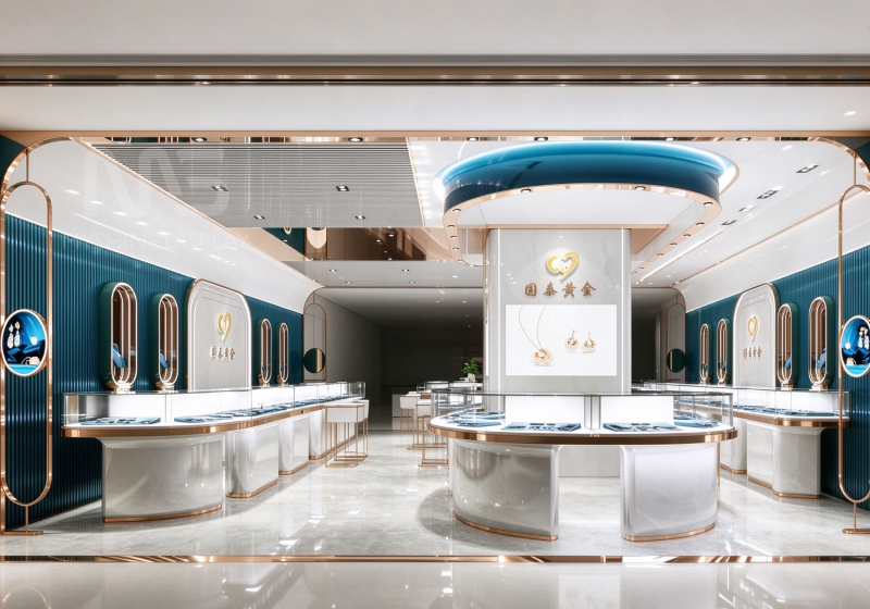
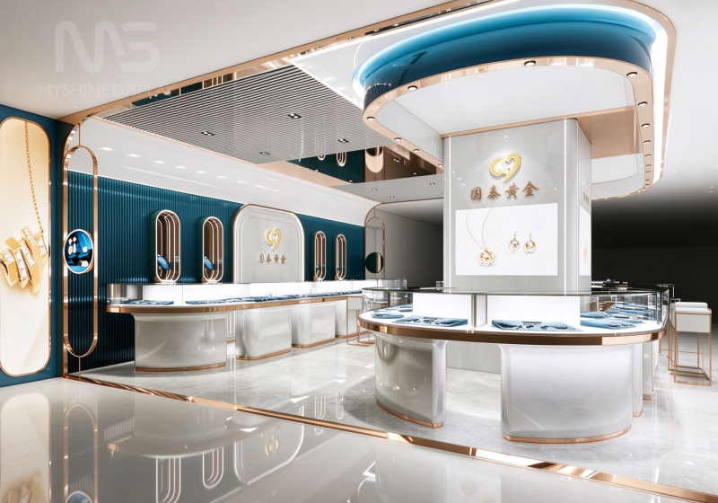
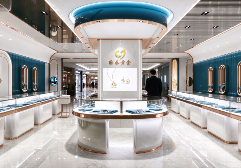
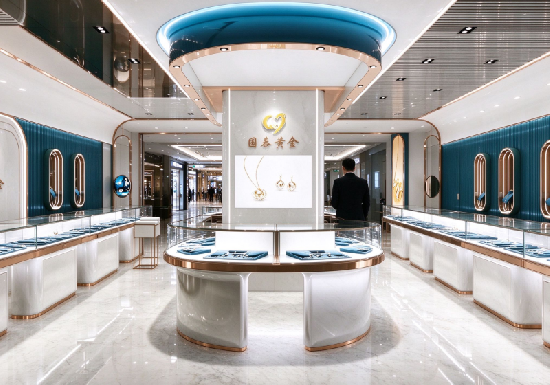
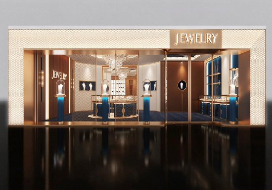
The color palette is inspired by the contrast between deep sea and
warm candlelight—a deliberate choice that works for gold, diamond,
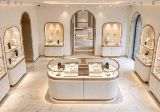
and jade collections alike.Longer Dwell Time: The curved, open layout
and soothing teal palette make customers feel relaxed—not hurried.
Retailers report customers browsing 2–3x longer compared to traditional
straight-counter layout. Higher Perceived Value: The combination of
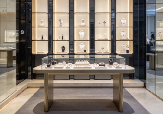
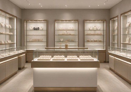
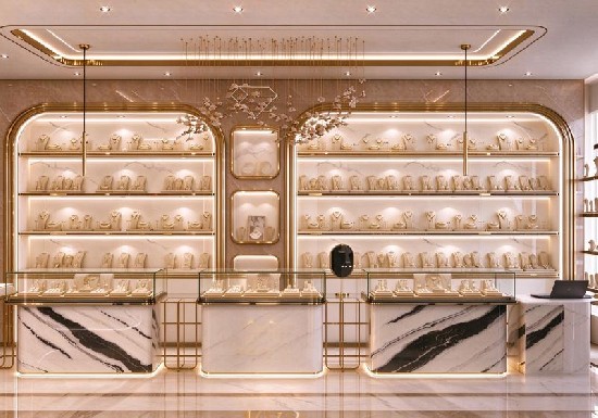
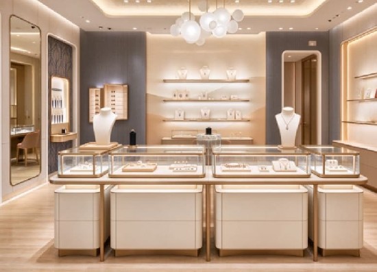
textured walls, brushed metal, and clean white counters signals
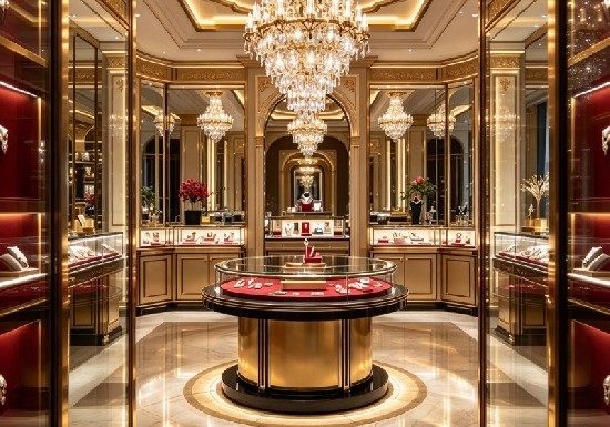
"premium" without the heavy, old-world feel of traditional gold stores.
This lets you price confidently.Social Media Friendly: The teal + rose-gold
+ curved architecture is highly photogenic. Customers naturally take
store photos, generating free social exposure.